The RSL Art Union approached PeakXD to help improve the user experience on their website — particularly the purchase path for single tickets and ongoing ticket subscriptions. I was lucky to contribute to this project as a student in PeakXD’s UX Accelerator course.
My role
All work/recommendations showcased here were created by me with feedback from the course facilitators. Data collection through user interviews (35+) and remote card sorting (30+ participants) was a team effort of the student body and PeakXD.
The Problem space
To future proof their charity work the RSL Art Union aims to increase the overall rate of ticket sales as well as improve their customer retention rate (specifically by increasing the number of VIP club sign ups) and average spend on tickets. Apart from not being able to actively advertise a flawed user experience within the purchase path on the RSL website was identified. Efforts should address the needs/motivations of 3 main target groups: Single ticket purchasers, VIP Club members (existing customers) and potential customers.
The Approach
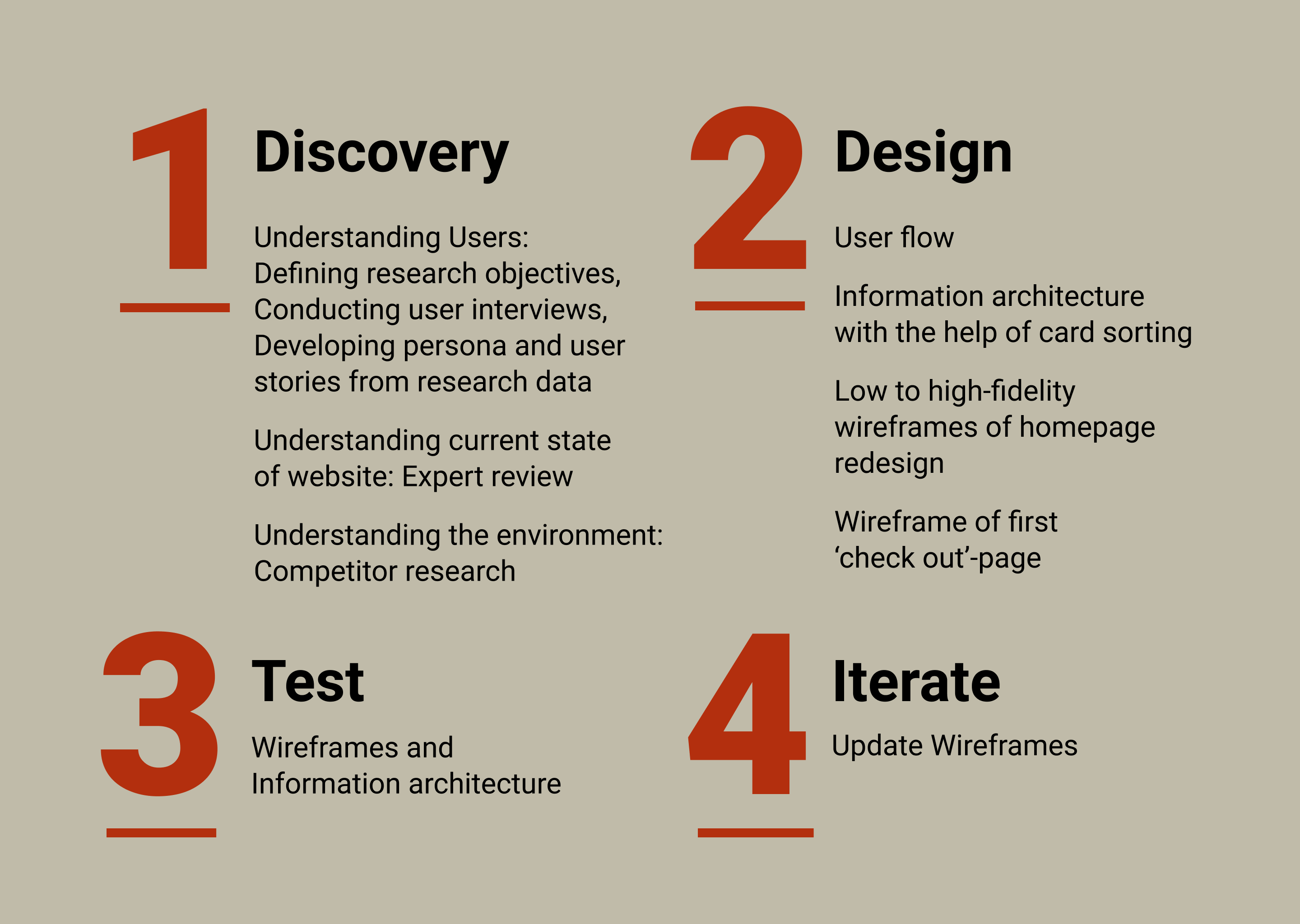
Understanding the Users
In order to identify problems during the ticket purchasing process on the RSL Art Union website, to understand why customers are opting for either VIP subscription or single ticket purchase as well as which factors contribute to the decision making process on ticket prize option the PeakXD team and students conducted 37 contextual interviews mostly with recent RSL Art Union ticket buyers.
After interviewing the research participant I was paired with, I analysed the data of this rich pool to consolidate findings and create a persona and extract user stories representing crucial insights about a target user groups.
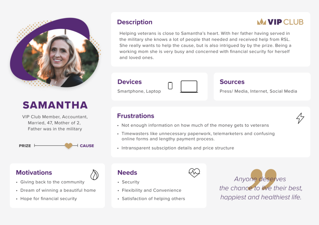
As a VIP Club member, I want to be able to manage my subscription online so that I can pause or adjust conveniently when my budget changes.
As a single ticket purchaser, I want to learn as much as I can about the specific opportunity/ property so that I can decide if I am interested in the draw.
As a potential ticket purchaser, I want to learn how the money is spent so that I am assured that the charity is legitimate.
There is an opportunity to make it more obvious that the lottery exists to fund a charity — reinforcing the message ‘your ticket is in big parts a donation’. And to better inform the user about the VIP Club, which might be perceived as attached to extra costs, even a lock-in contract instead of a convenient lottery ticket subscription with more chances to win.
State of the current website and a look at competitors
A heuristic evaluation, a review against usability guidelines, was conducted to identify usability problems in the design and provide recommendations to counter them.
I discovered that the use of Jargon terminology, e.g. ‘VIP Club’, representation and structure of the information architecture and confusing visual treatments of page elements might make it hard for users to navigate the page and find the information they were looking for.
A closer look at the current task flow showed that the purchase path is inconveniently divided between single ticket purchases and joining the VIP Club. To Compare options for ticket numbers, prices or a subscriptions the user would have to go stop and restart the purchase path process over.
Most notably looking at competitor’s websites was that all of them had an option to subscribe to regular lottery subscription right after purchasing tickets for one draw. They also advertise their cause prominently and draw users in with large header images. Conventions potential customers might already be used to.
So I developed a new task flow for the RSL Art Union website in Lucidchart that gives the user the opportunity to choose ticket options and draws first and then decide if they want to subscribe to ongoing draws after.
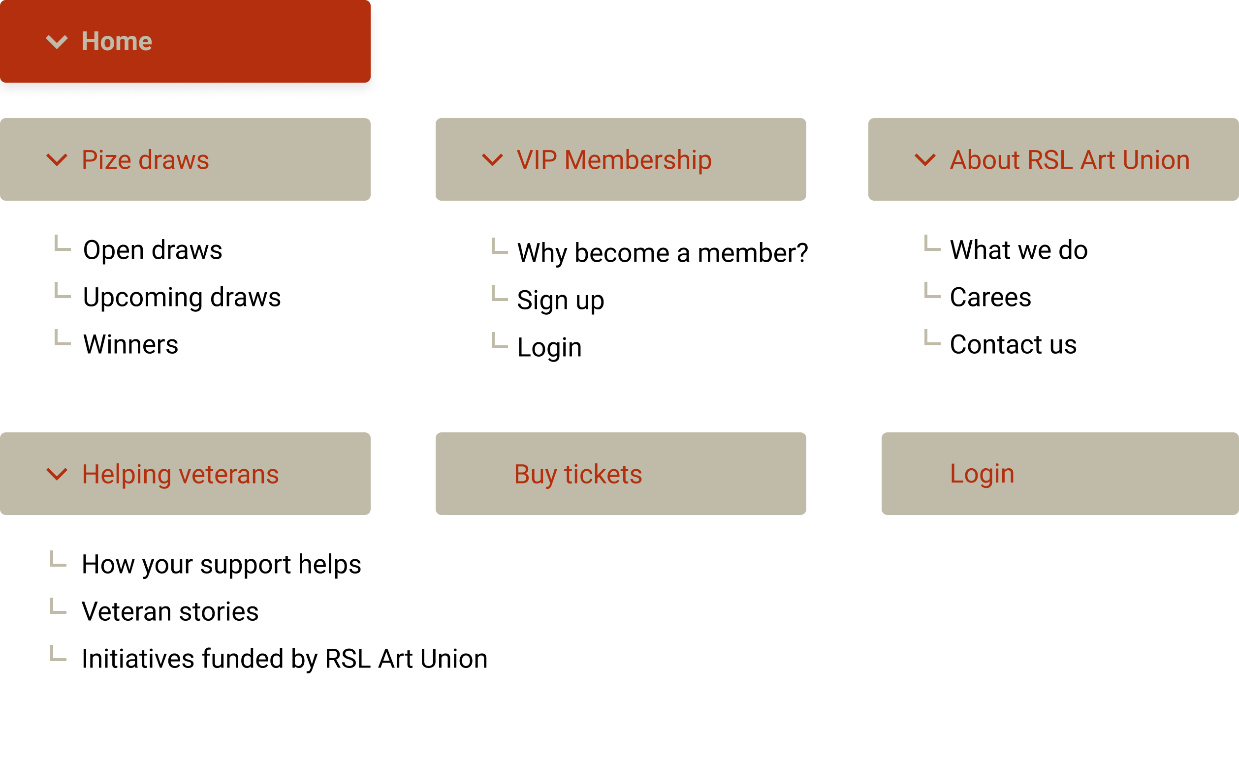
Card sorting and IA design
Our team planned and conducted a remote card sorting activity (using the optimal workshop suite) and recruited 30 participants to understand the mental models of potential RSL Art Union website users. I analysed the results of this activity to design the first 2 levels of an improved information architecture.
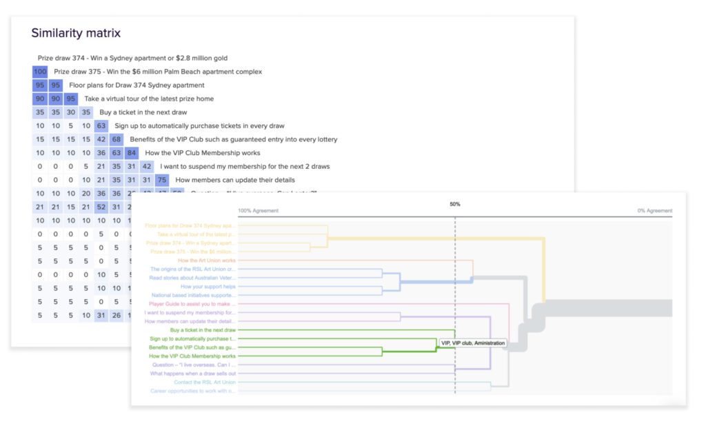
Improved Information Architecture
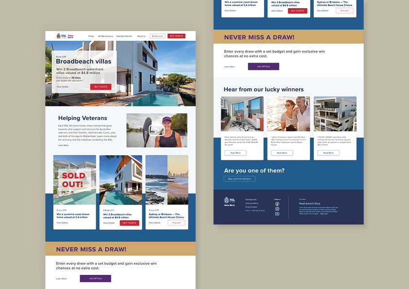
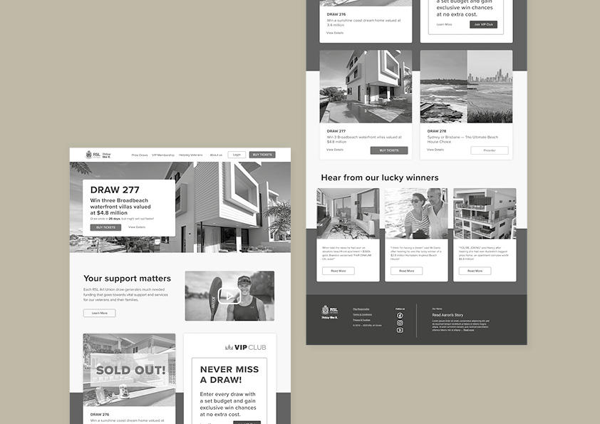
Low to high-fidelity wireframes of the homepage redesign
With the findings of the discovery phase in mind I sketched low fidelity wireframes of what an improved homepage might look like for the RSL Art Union, created an electronic wireframe of the most promising solution, and after some team feedback, developed a high fidelity wireframe ready for testing with a potential user.
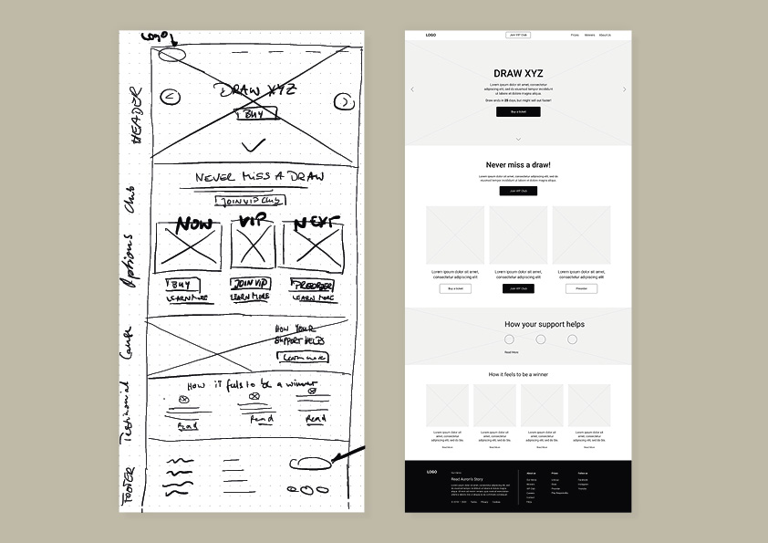
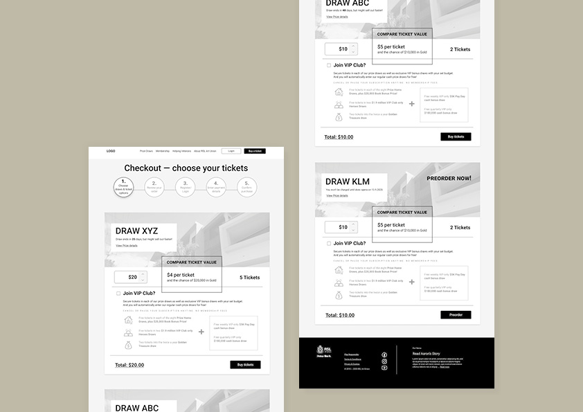
I was also interested to explore what the new check out flow might look like and following the same process created wireframes for a ‘ticket option/ check out’-page.
Usability testing
To test the new IA and the wireframes I recruited a charity supporter and occasional charity lottery player via Askable. I guided and observed the participant via Zoom while they performed a first-click tests I set up in Chalkmark and tasked based IA testing with the help of Treejack. I also collected qualitative data on experience with the help of a post-test questionnaire.
Iterations after testing
- ‘Login’-button became ‘My account’ to hint on where to go to change or pause subscription.
- Changed the headline of the intro section to the more succinct ‘Helping veterans’.
- Used property type and location as the main headline for each draw.
- ‘Never miss a draw’-section looks similar to the intro section now to avoid banner blindness.
- Added a crosslink to the winners page underneath the winner story.
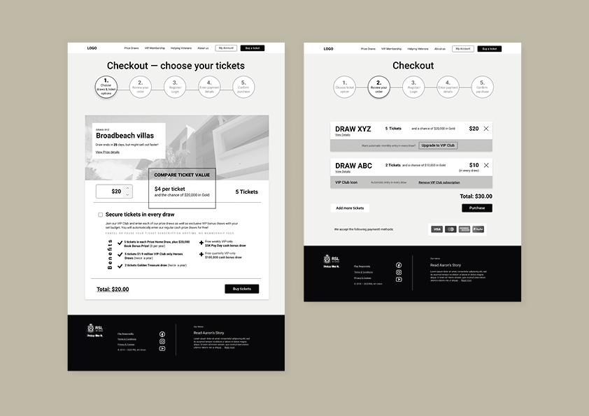
- Changed CTA from ‘Join Club’ to ‘Secure tickets in every draw’ to emphasise the benefit.
- Reduced choices to one draw and invited users to enter another draw on the review page to avoid choice overload and overwhelm.