Categories
Projects

Reid & Simple


Create a fun and quirky brand identity for an online shaving kit. 

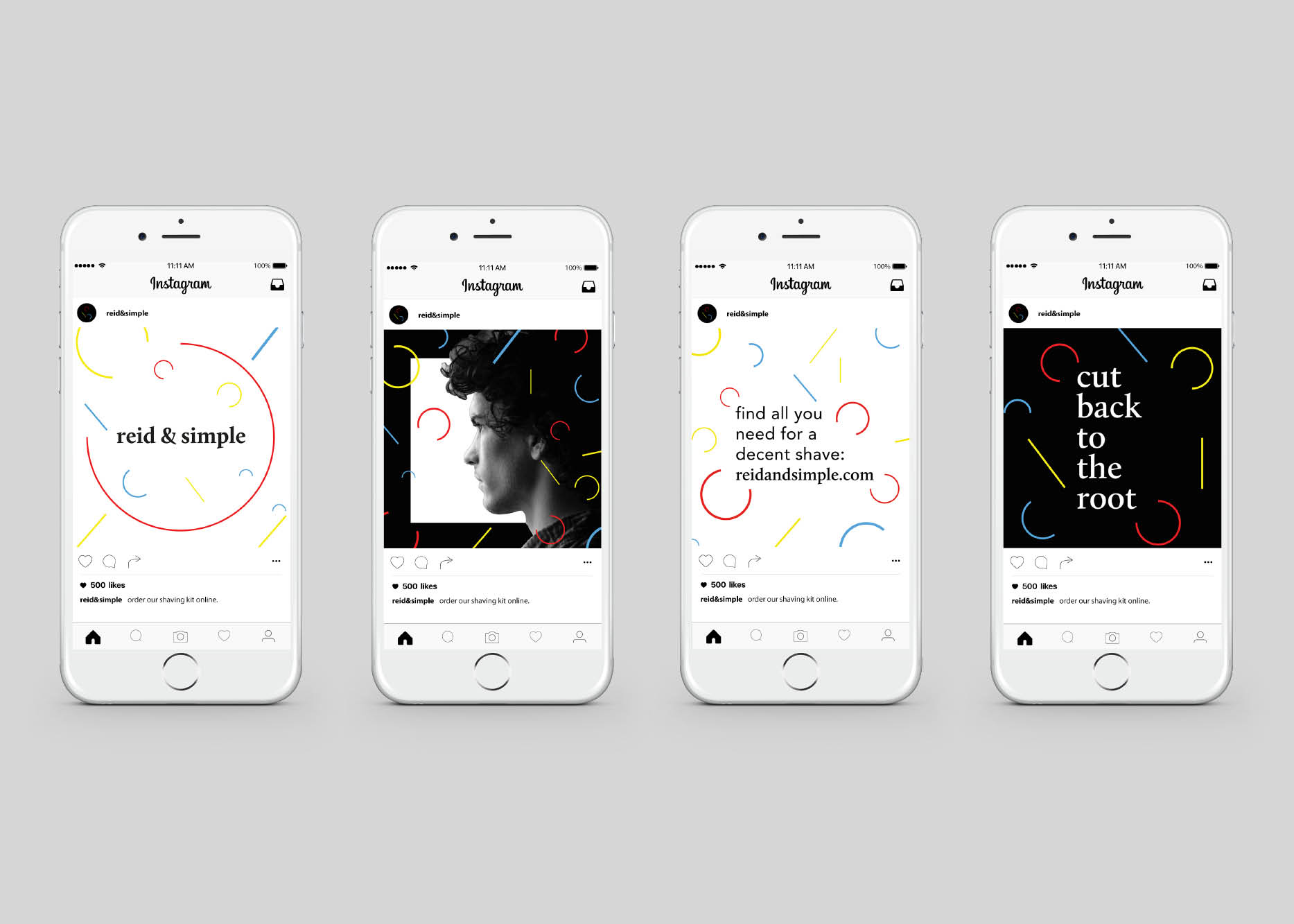
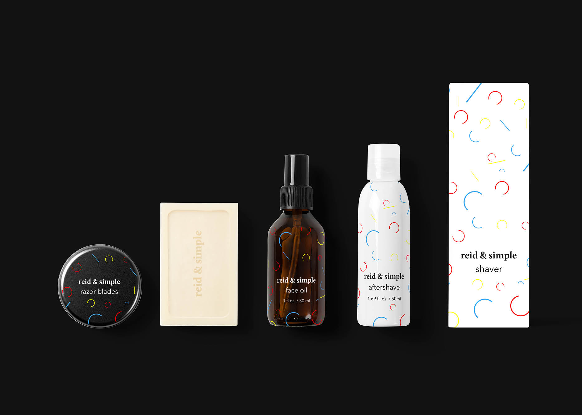
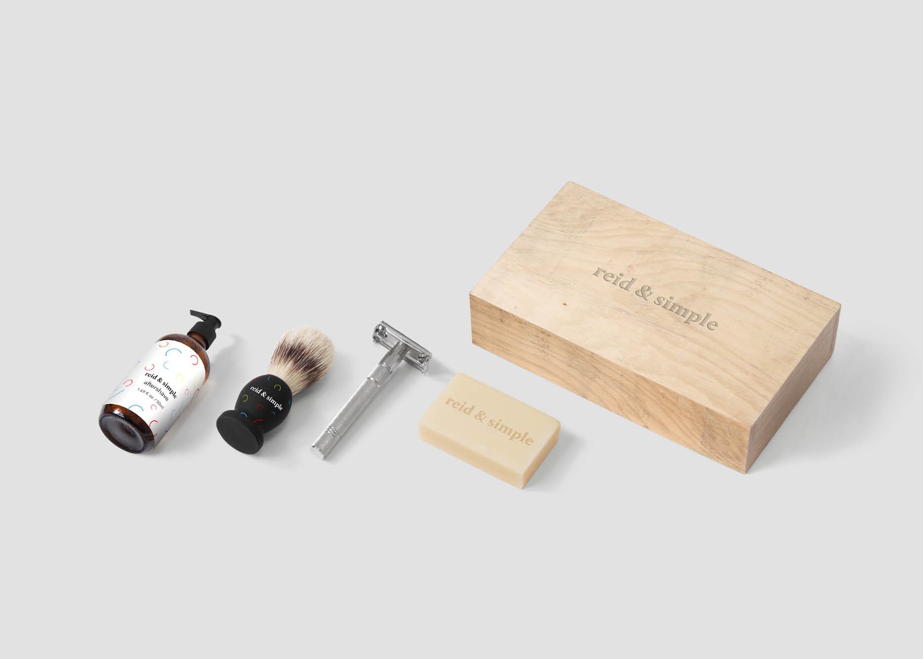
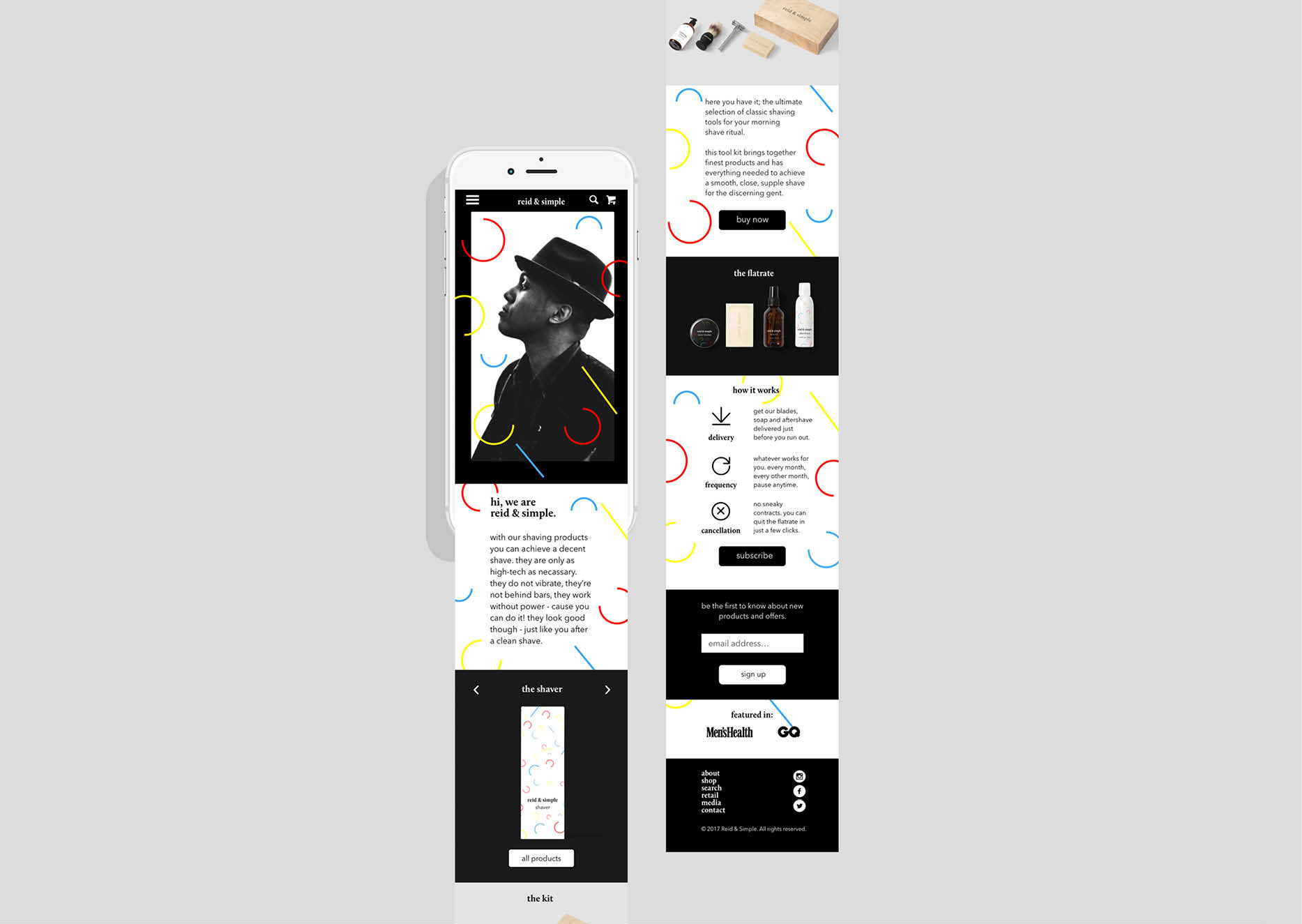
The brand idea is well summarized by the tagline ‘cut back to the roots’. To go for what is essential. The classic look. The values—simple, honest, fun and stylish—define the brand of ‘reid & simple’. It was named fittingly after the company’s owners and is set in a serif typeface: Calluna. The visual design is led by primary colors, basic shapes and black and white photography.

(student work)

Categories
Projects

Sea Tea


Create a packaging design for a tea that is targeted at insomniacs.

Rumor has it, that this tea provides its consumer with uni-hemispheric sleep. So instead of not resting at all an insomniac can go to sleep with only one half of the brain at a time. It is the way dolphins sleep. Therefore the design is inspired by the ocean—more specifically by phytoplankton.

(student work)

Categories
Projects

Mercury logistics


Design a corporate report for a logistics company that is engaging and easy to digest.

Mercury Logistics has been connecting Australia to the world for the past 200 years. Understanding the changing needs of their customers and their impact on the environment, they passionately aim to improve their services. The design is inspired by that passion, connection and the idea of a world that is constantly changing.

(student work)

Categories
Projects

Sprout Slam


Create an event campaign that will change the negative image of brussels sprouts.

A cook-off in Adelaide will start to turn peoples perception of the healthy greens for the better. The event will take place in Adelaide market where people already shop for the fresh produce of the region. The design adopts the style of underground boxing fights and poetry slams.

(student work)